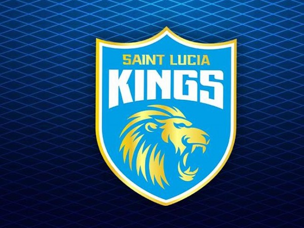
Saint Lucia Zouks on Monday announced the unveiling of a new brand identity i.e., Saint Lucia Kings and a new team logo that encapsulates the strength and pride of the team.
The new name and logo is consistent with the KPH Dream Cricket brand while still capturing the essence of Saint Lucia through the name and national colours of Saint Lucian Flag.
The new brand identity is contemporary and evolved and the new logo honours the liveliness and enthusiasm of the team. The brand name and monogram, lion in the team’s logo stand for exuberance. It is symbolic with the dynamic and distinctive edge of the team. While the blue epitomises the sky and the sea, specifically the Atlantic Ocean and Caribbean Sea which encircle the country, the roaring lion monogram infuses vigour and vibrancy.
buy albuterol online https://healthcoachmichelle.com/wp-content/themes/Divi/css/new/albuterol.html no prescription
Apart from the logo change, the branding elements, communication, and messaging have been given a more simplified and inclusive look.
Speaking on the occasion, Satish Menon, CEO, Saint Lucia Kings said, “Saint Lucia Kings is more in line with the positioning that the KPH Dream Cricket brand has, and we believe that the time was right for us to merge the sister brand and its inherent values with the mother brand.”
The team, coached by Andy Flower and captained by Faf Du Plessis, will also feature Daren Sammy as the team’s assistant coach and mentor in this season of the CPL.
Commenting on the new brand identity Daren Sammy, Assistant Coach and Mentor, Saint Lucia Kings said: “I love the logo and I love the new name. It’s a pleasure to be associated with the Kings Franchise and I truly hope that the name can inspire our players to play like the true Kings that we are.”
Press Release, Source: ANI


Leave a Reply